Go Kinetic is a portal for consumers with Kinetic internet service to monitor their equipment, pay their bills, and submit requests for technical support. I was brought onto the project team to achieve two formal objectives:
- Bring the portal in line with Kinetic’s new brand.
- Show a user’s orders and support requests on their home page.
The Rebrand
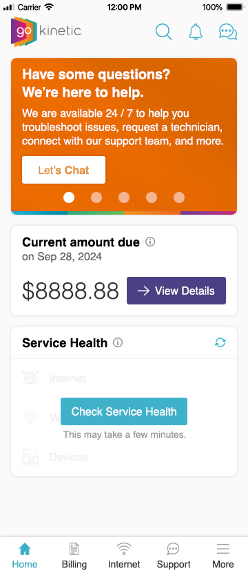
Because updating everything about the portal’s branding would be a lengthy process, I quickly devised a roadmap to a minimum viable product: in the next development sprint, typefaces, colors, and basic UI components would all be updated to match the new visual identity from marketing.
Future sprints would bring individual sections of the portal in line with the parts of the brand that required more careful (read: time consuming) quality assurance: new typographic scales and a new spacing grid to apply to every single element of the layout which, if implemented too hastily, could break page layouts in unexpected ways.
The New Widget
While keeping up with QA on the rollout of the new brand, I worked with the customer experience (CX) experts on finding a place on the dashboard for orders and support requests, while simultaneously working on a third objective of my own:
- Improve the user experience of each section that I touch by making them more scannable.
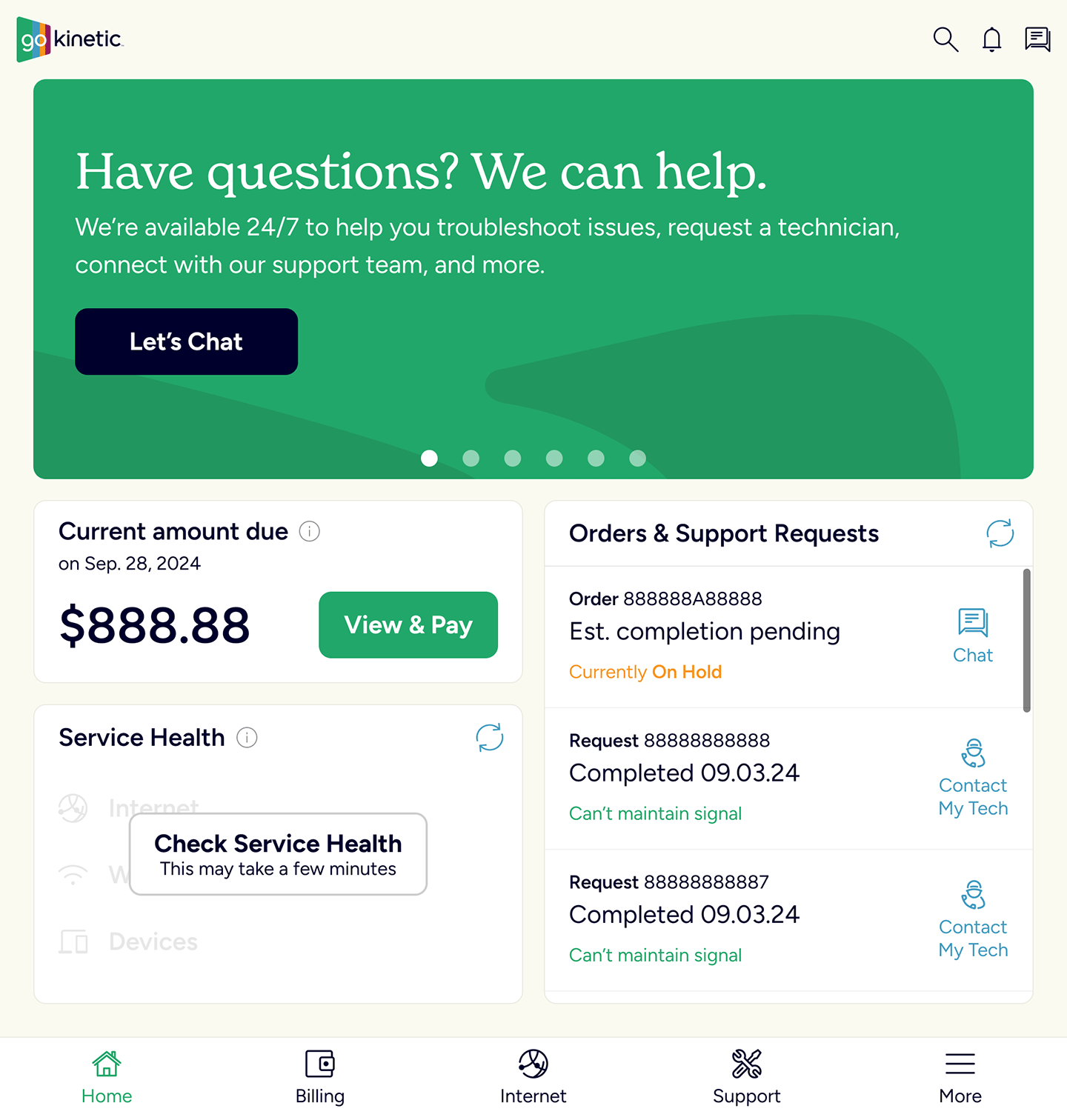
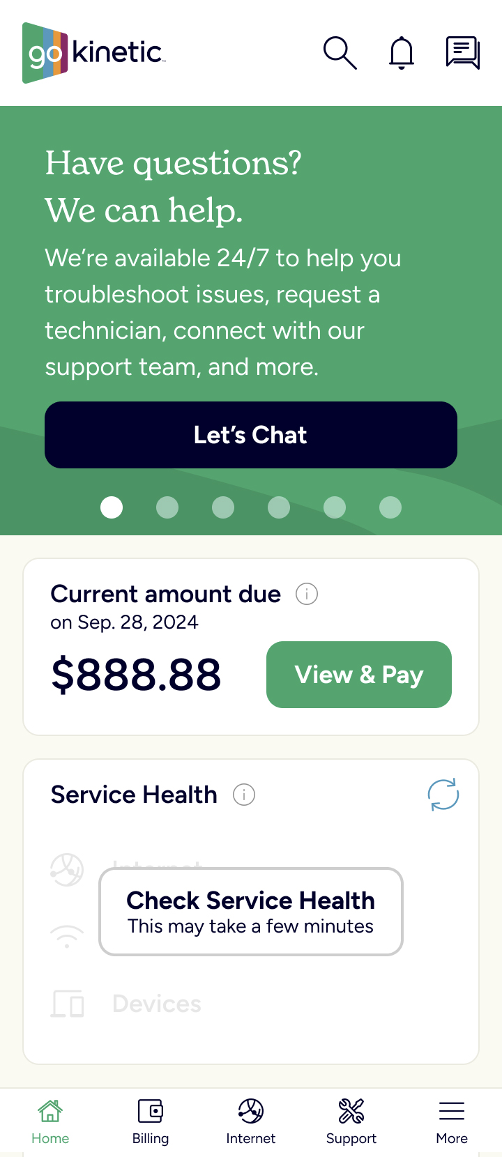
User data told us that individual customers almost never had more than two orders or support requests open (or recently closed) at any given time. So, given limited screen real estate, I designed a widget that would show two records, and scroll to accommodate others. At the dev team’s suggestion, the total was capped at four to keep loading time down, and the list of records would end with links to the dedicated “Orders” and “Support Request” screens in the portal.


Unexpected Feedback
In gathering customer feedback, we asked about the new features included in the new widget and on the dedicated “Orders” and “Support Request” screens. Users loved the functionality… if they could find it. I was confused; this was exactly the problem that the home page widget—which prominently displayed the new features—was meant to avoid!
But one of our CX experts seemed less surprised: they’d been on the Go Kinetic team longer than I had, and they’d gotten this feedback on other home page widgets too. This gave me an idea: if every widget was getting this sort of feedback, then maybe the problem wasn’t every widget, maybe it’s the dashboard itself.
I reexamined the dashboard, focusing on its structure and how it responsively resized and reorganized its widgets. I found two problems undermining the page’s usability:
- The widgets responsively compressed themselves vertically so they would all fit in the user’s viewport. But this cropped important content out of widgets, including calls to action like the “View and Pay Bill” button!
- The widgets also responsively expanded horizontally to fill the user’s viewport, which made things harder to visually scan for; on larger monitors it was all too far apart to take in at once!
Just as the problem was twofold, my solution was as well:
- Responsively change the dashboard from a fluid layout to a fixed-width layout above a certain viewport width, keeping the content narrow enough to scan.
- Only let the Orders & Support Requests widget—which is a list of variable length—scroll vertically. (Even then, only in views of the dashboard that had more than one column.) Make the other widgets display at their natural height and allow the entire page to scroll to encompass them.

With the proliferation of mobile devices, most users expect to scroll a page vertically, even in desktop environments. But sometimes stakeholders can find that hard to believe. They can also find it hard to believe that white space can be good, actually! But by talking with the CX team about these proposed changes first, we were able to present a united front to the product owners, and get the changes approved.
Project Results
- The overall dashboard redesign made it easier to find the button used to quickly pay users’ bills, reducing the number of support calls needed to handle such transactions.
- The new Orders and Support Requests widget allowed users to contact field technicians assigned to them directly, further reducing calls to customer support.